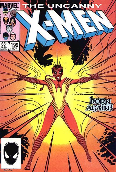
 In honor of the 5,000th cover added to our extensive and ever-growing Cover Gallery, I wanted to take a look at some X-Men covers of the past that have had a major artistic effect on both the X-Universe and the comics industry in general. Everyone has their own favorite cover or a cover that hooked them in to reading comics in the first place. For me, it was the cover to Uncanny X-Men #199 (1985) that caught my eye and introduced me to the band of misfit heroes called the X-Men. It’s been a love affair and constant in my life ever since outlasting friendships, jobs and partners.
For every comic fan, there are covers and images that resonate with you and leave a lasting impression. But there are some covers that transcend this individual impact and become something more. They take on a broader artistic importance in the minds of comic readers. These are the covers that become iconic, in one fashion or another. They set a tone or represent a moment so perfectly or powerfully that the image is invoked again and again in an attempt to recapture that same energy, emotion or dramatic effect or to set a specific tone for a long-term reader. This article is going to take a look at some of the X-Men covers that fall into this unique category. While this is by no means a definitive cataloguing of such images, it takes a look at a handful of X-Men covers that are important to the X-Men mythos and have been the subject of multiple “homages” or have inspired other influential covers.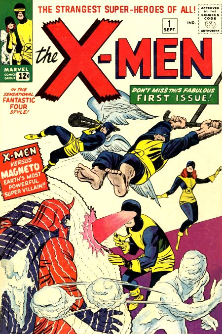
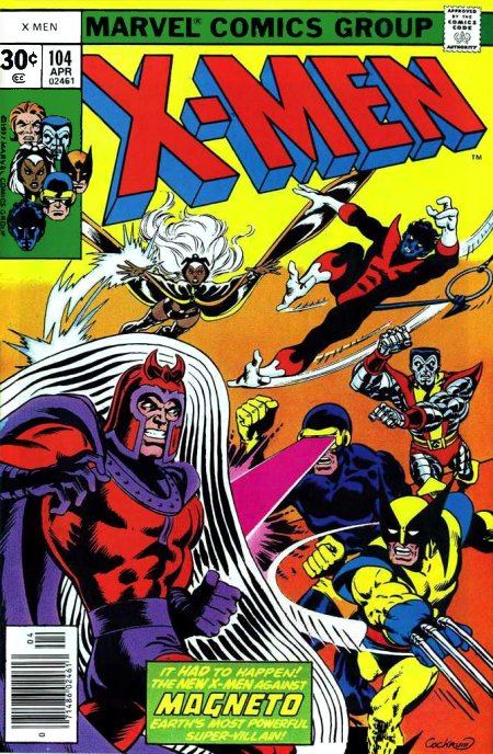
First up is the one that started it all, the cover to X-Men #1. Originally released in September 1963, this classic image by Jack Kirby depicts the original team of Marvel Girl, Cyclops, Beast, Iceman and Angel charging towards their arch-nemesis Magneto.
Over the years this cover has inspired others, most notably Uncanny X-Men #104 and Classic X-Men #12 which both feature the second generation team facing off against Magneto and Thor #427 which shows the original Excalibur members charging both Thor and the Juggernaut. The cover to X-Men (2nd series) #1 released in 1991 is a modern rendition of this same cover with Magneto in a magnetic force bubble being assaulted by the full battalion of mutants that comprised the 90s X-Men.
 XXXXX
XXXXX 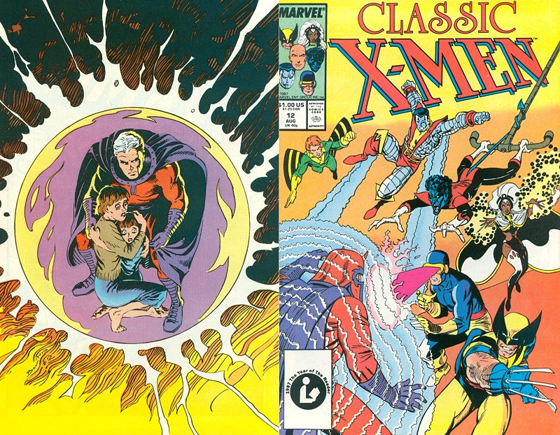 XXXXX
XXXXX 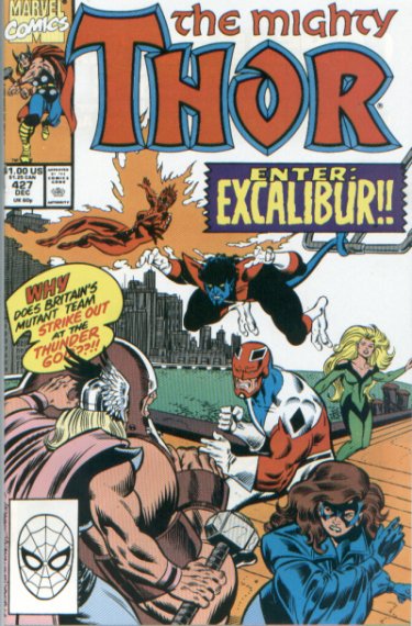

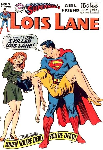
The X-Men hit a new high with the teaming of Chris Claremont and John Byrne. This is evidenced by the cover to Uncanny X-Men #136 by John Byrne released in October 1980. This classic image of Cyclops holding the defeated Dark Phoenix speaks volumes about the pain and anguish of the young and oft-tormented leader of the X-Men. The history behind this cover is actually quite interesting and complex. 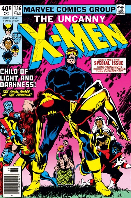 There is a long-standing tradition in comics of a hero holding a fallen comrade, lover or friend in this and similar poses. Some believe this cover may have been “inspired” by the cover to Lois Lane #102 which depicts Superman holding the lifeless body of Lois. This image was published in 1958 but there are many other early images that are similar. Lois Lane #128 is an even closer rendition. Despite the distinct similarities, artist John Byrne insists that he hadn’t seen or directly referenced any of the previous covers when he created the cover to Uncanny X-Men #136. This was the first prominent modern usage of such an image and it then “inspired” an even more famous cover by George Perez: Crisis on Infinite Earths #7. Released in 1985, this classic image has eclipsed that of Cyclops and Dark Phoenix to become one of the most frequently mimicked images at DC Comics. But I still contend that it was the Uncanny X-Men cover that brought this anguished image into the modern age of comics. Marvel did get one humorous homage to this cover in before the advent of the Crisis on Infinite Earths cover … the not-quite-classic cover to Obnoxio the Clown Vs. the X-Men #1! The most recent use of this can be seen on the cover to Phoenix: Endsong #4. In this instance, Emma Frost “stands in” for Jean Grey. This emphasizes the importance of the Cyclops/White Queen relationship and reflects the many ways in which Emma Frost has replaced Jean Grey as Cyclops’ paramour and an influential member of the X-Men.
 XX
XX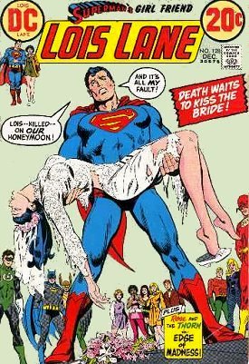 XX
XX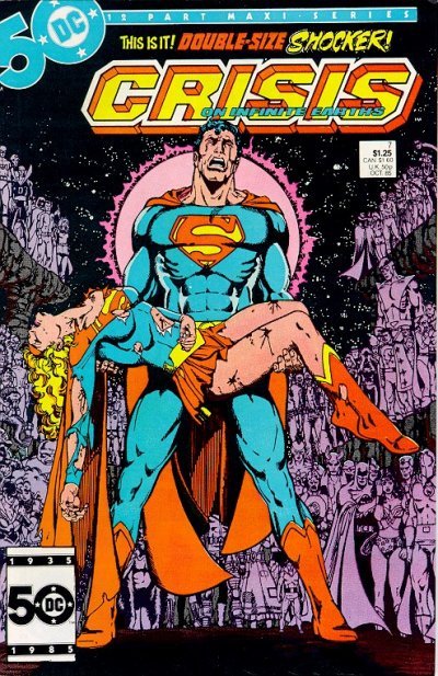 XX
XX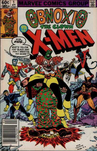 XX
XX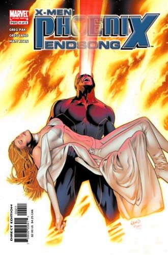
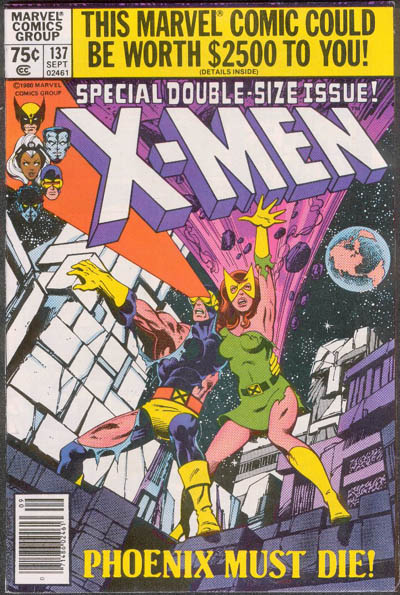 John Byrne was on a roll during the creative heyday of his Uncanny run with Chris Claremont. Hot on the heels of Uncanny X-Men #136 is the equally classic cover image used on Uncanny X-Men #137. This image of a battered and beaten Cyclops and Phoenix standing together in one last defiant attack captured the heart of the finale of the Dark Phoenix Saga perfectly. While not the most imitated cover among the X-Men, it does provide a great example of how a well-placed cover homage can help to give readers a sense of the story within.
  This famous pose was used again for the cover of Exiles #4 when the reality-hopping mutant team visited the trial of Phoenix. Not only did this recycled pose help to establish the temporal setting for this latest Exiles’ adventure, it also conveyed the emerging romance between Blink and Mimic that took a major leap forward in this issue.
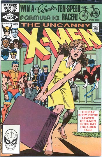
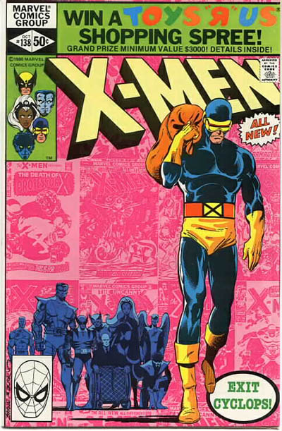 Byrne hit the jackpot with his third important cover in row with the cover to Uncanny X-Men #138. With the death of Jean Grey, Cyclops decided to take a long-overdue break from his life as an X-Man. The cover image of Cyclops walking away from his assembled teammates is one that has been used time and time again to mark the exit of a major character from an X-Team.
The most notable examples of this come from Uncanny X-Men #151 (Kitty Pryde), Uncanny X-Men #318 (Jubilee), X-Men #57 (Professor X), New Mutants #99 (Sunspot) and X-Force #44 (Cannonball). In each of these cases, a long-time defining member of the title is leaving and this cover homage marks the impact of that departure on the future of the team. An interesting reversal of this homage can be seen on the cover to X-Force #70 when the entire team leaves Cable behind. Evoking the famous image of the key teammate leaving really drives home the idea that the entire team is heading off in a whole new direction and leaving their mentor behind.
 XXXXXXXX
 XXXXXXXX
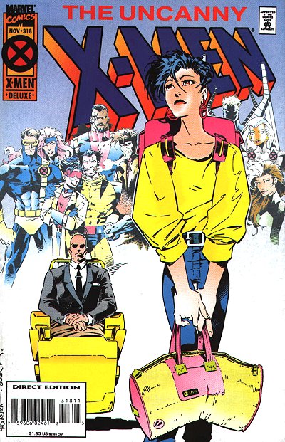 XXXXXXXX
 XXXXXXXX
 XXXXXXXX
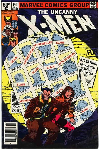
In retrospect, it’s difficult to believe that Byrne and Claremont could ever possibly match the awe-inspiring scope and overall impact on the X-Universe and comics industry that they achieved with the Dark Phoenix Saga. But lo and behold, just a few issues later they unveiled Days of Future Past, arguably one of the X-Men’s greatest and most often invoked and imitated tales.
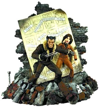
The cover to Uncanny X-Men #141 captures the desperate spirit of this shattered future timeline for mutantkind. The cover is so iconic it was made into a sculpted diorama in addition to inspiring covers such as Excalibur #94 and being spoofed with the cover of Alpha Flight (3rd series) #9.
 XXXXXXXXXX
 XXXXXXXXXX
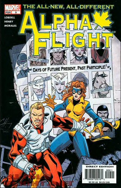
The core X-Men titles weren’t the only X-related series that spawned influential covers. Various X-series have crafted a cover image or two that has become a lasting model for other covers within that series.
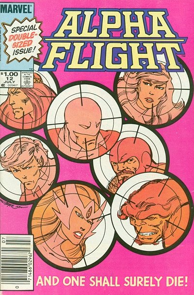
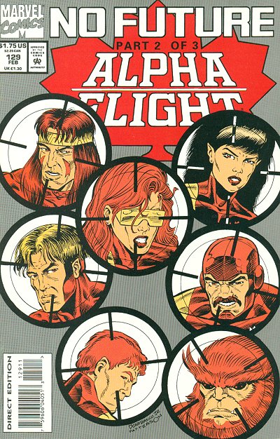
For example, the cover to Alpha Flight #12 (also by John Byrne) served as the basis not only of Alpha Flight #129, but was used for issue #12 in Alpha Flight’s second and third volumes as well!
This homage was a nice way of creating some continuity between the three volumes while also drawing attention to the fact that the series has been launched (and cancelled) three times!
 XXXXX
XXXXX 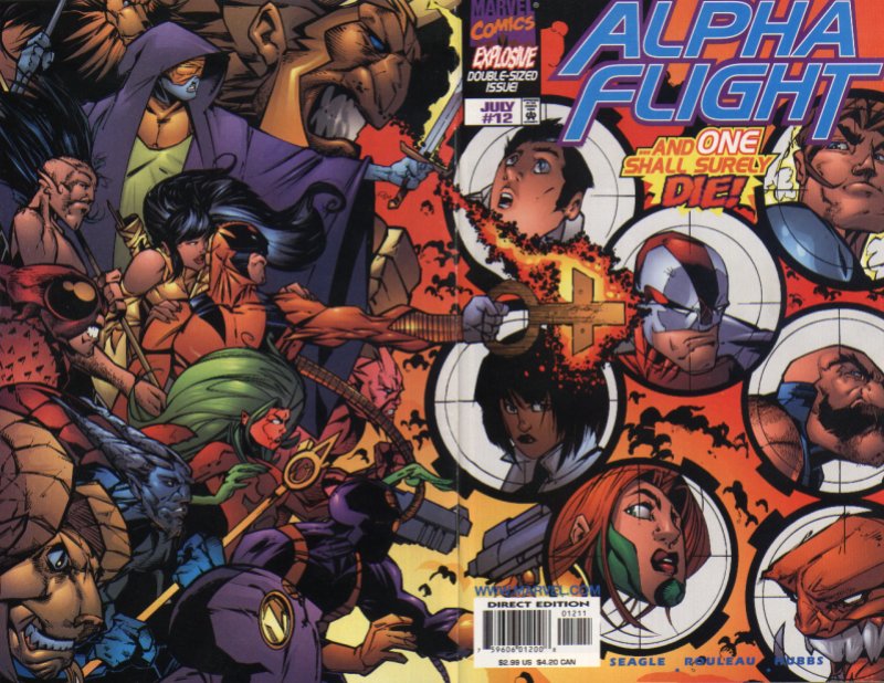 XXXXX
XXXXX 

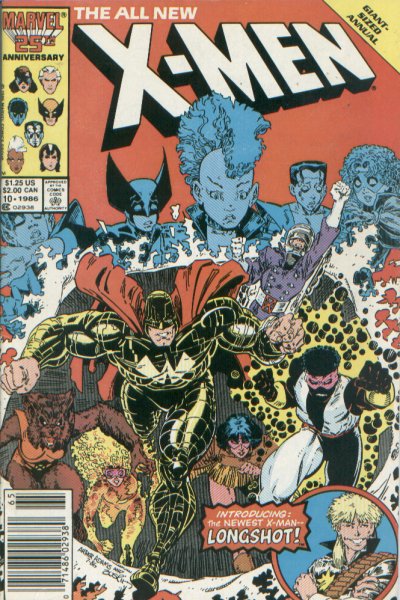
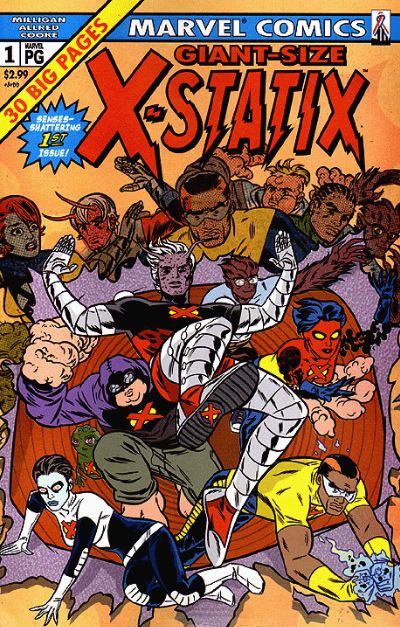
Despite the long-lasting tributes to these covers and their influence over the years, there is one X-Men cover, designed by Dave Cockrum, that is the granddaddy of them all when it comes to being the subject of an artistic homage. Giant-Size X-Men #1 introduced the world to a new team of mutant heroes that included future mainstays such as Storm, Nightcrawler, Colossus and Wolverine.
The dramatic image of the new X-Men team bursting through the cover with the shocked faces of the original team hovering above has become the defining cover scheme for introducing a new team to comics. It has been used to signal the changing of the guard on numerous occasions and has been parodied countless times. Whenever an artist needs to introduce a fresh new set of characters, this cover layout has become a perennial favorite. Below is a mere sampling of such covers.
 XX
XX XX
XX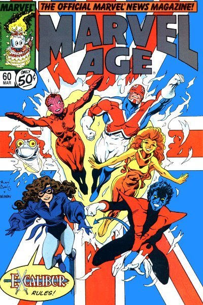 XX
XX XX
XX
 XX
XX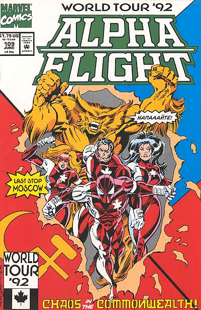 XX
XX XX
XX
 XX
XX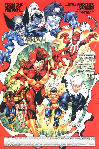 XX
XX XX
XX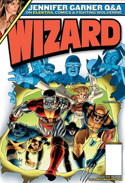 XX
XX
 XX
XX XX
XX XX
XX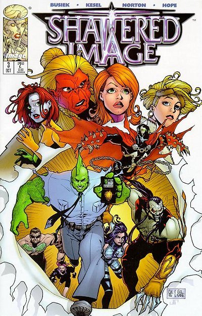
They say that “Imitation is the sincerest form of flattery.” If that is the case, then the artists who have crafted the covers discussed above should feel quite honored. Their work has made a significant impact on readers and fellow artists for decades and have helped to create images that have reached a special level of recognition and import in the world of comics.  The next time you see a great cover posted in our Cover Gallery, take a moment to consider whether it might have what it takes to become the next great X-Men cover.
(And just for fun… here’s an X-Men cover homage that didn’t quite make it, along with some interesting articles explaining why. Remember, sometimes imitation isn’t flattering…it’s illegal!)
- House of Spain vs. House of M?
- Spain’s Royal House vs. Marvel’s House of M
Sources and further reading:
Sites collecting examples/discussions of comic cover homages:
- Snark Free Waters
- Vu’s George Perez site - Pieta Covers
- Vu’s George Perez site - Homages
- John Byrne Forum
Other interesting X-Men Cover articles/discussions:
- X-Fan’s Top 10 X-Cover List
Non X-Title Covers found at:
- Soulmanic (DiscoTronic Funk Commandos)
- McFarlane Archive (Shattered Image #3)
- Superman Homepage (Lois Lane covers)
- The Continuity Pages (Crisis on Infinite Earths cover)
- Wizard Entertainment (Wizard #159 cover)
- Dynamic Forces (DofP Diorama Statue)